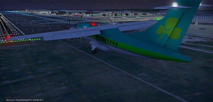
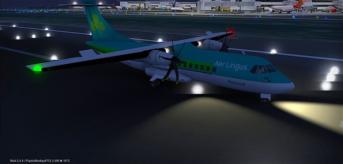
We always need that Aer lingus 320!
I’m Irish, so I have almost all just A320NEO and A321NEO from BFS!
It’s a shame they removed it aswell as the Brussels and Air Cyprus livery that are all now boring eurowhite
Yeah I miss back when all aircraft liveries didnt look pretty much the same
THEY NEED THE 319 ANDDDDD A220
This is a sentence
I feel like livery designers now are eather
- Lazy to design a livery and just add colour and logo in the back and that’s it.
- Copying outer airline livery and change the colour and call it there own.
I feel like if an airline doesn’t come out with an Outside the box livery or something like that then the entire Avation industry would look like just White in the future.
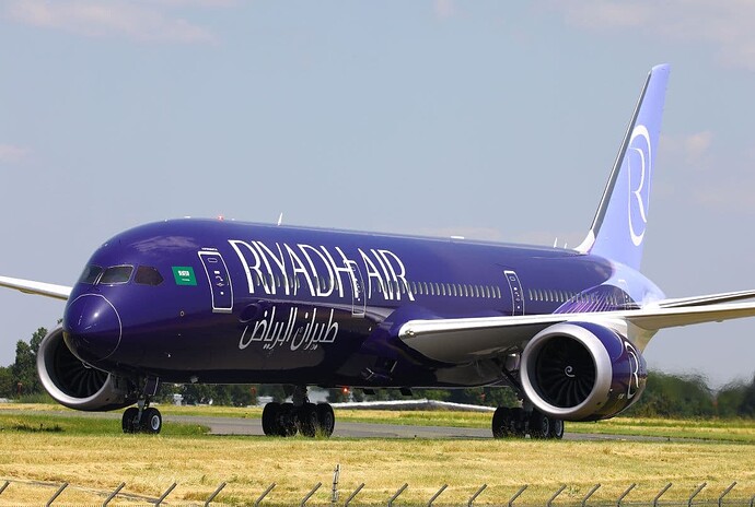
Atleast some airlines like riyhad seem to be trying to come up with a cool livery
And condor having the different colours
Funny thing is, when a different livery does come out people spit their dummies out and say it’s awful, such as Condors livery which I’ll admit has grown on me since it was first unveiled.
From what I know it’s due to white paint being lighter and reflecting sunlight better. The amount of fuel wasted on one flight due to paint weight seems trivial but over millions of flights it stacks up
I’m not a fan of the Riyadh air livery (tho it could because it doesn’t fit well with the 787) same with Condor old livery (which was Thomas Cook based) take Wizz air old livery for example it stands out couse of the pink in the front and logo in the back.
Same with Icelandair. The old livery is better but. The new one has grown on me.
One thing to remember is “copyrights”. You just can’t put whatever airline you want in a game where the devs make a profit. There has to be a signed agreement between WoA owners and the airlines to use any airlines image/likness/anything in the game.
Best livery’s in Europe is ITA Airways and KLM.
Let me guess your favorite color: blue.
Not really ![]() just better then boring eurowhite. Plus how can you not like them especially ITA.
just better then boring eurowhite. Plus how can you not like them especially ITA.
I agree with euro white, but ITA and KLM aren’t great either. I find ITA’s shiny blue to be overwhelming and jarring. KLM just kinda feels bland, the shade of blue lifeless.
Yea i feel like BA has a great livery (not biased…) but they do. Its simplicity works really well on all the aircraft in their fleet. And the red and blue blends really nicely together. Same with the united evo-blue its nice and simple but still good.
I find both better than, say, ITA, but, I think that they’re both just too simplistic for me, I think Evo blue is a little better though. I like Finnair for Europe, or even Icelandair. Globally there are so many better options though.
Icelandair was good till they ruined it. See I think Finnair bit boring as well. BA is okay but doesn’t beat their Landor livery they had.


