Ok good, thought it was just me that didn’t know how to use the new UI correctly
1 Like
I am so hung up on trying to figure this out that it is taking away from me really being able to explore the new features! And even to play the game.
3 Likes
It looks great, but there is no guide that tells me what this stuff means and how it works! I did the tutorial, but I am having a hard time reading the plane tags and what some of the indications are. And the “needs action” filter needs action. It is showing me planes for which there is no action possible.
2 Likes
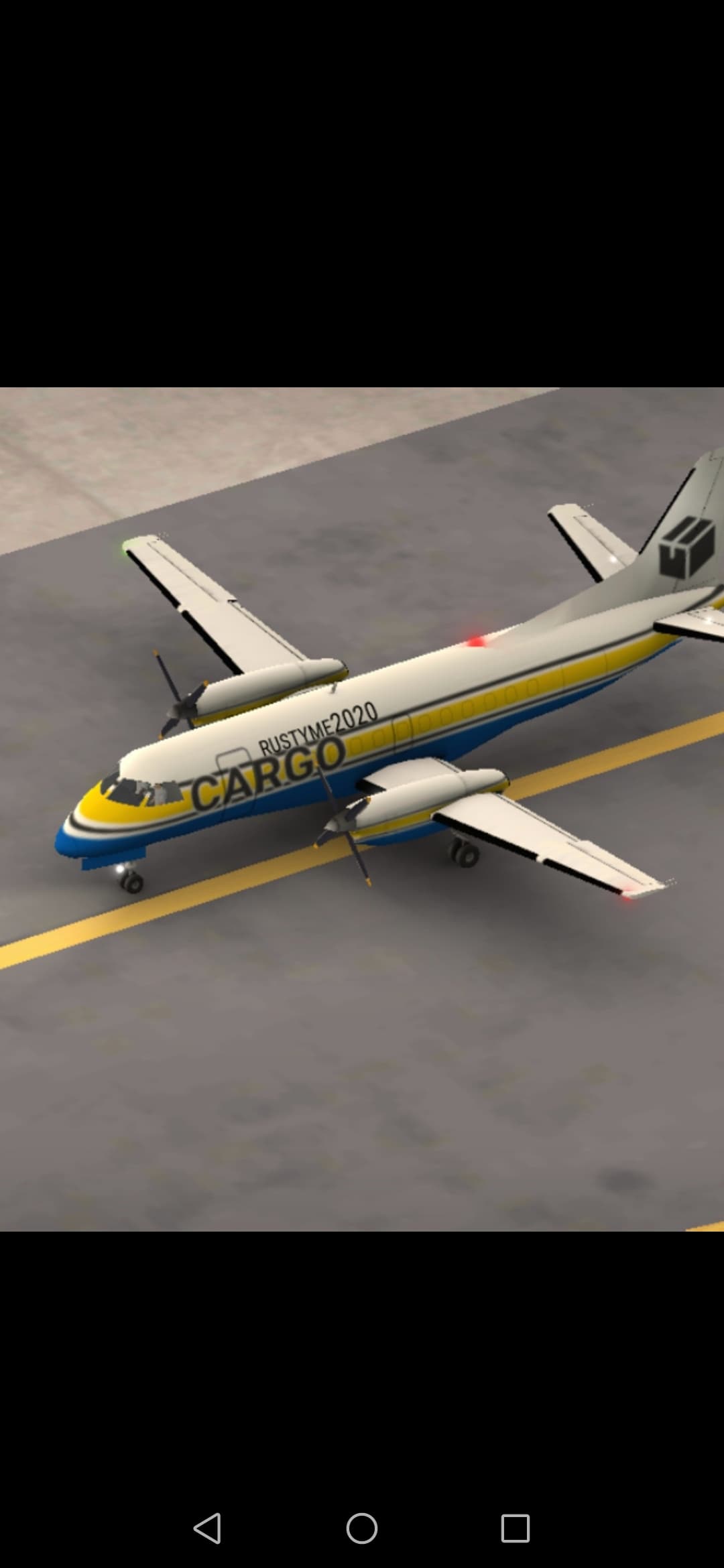
But why disappeared the our logo on the few special airplanes???
With the new update:
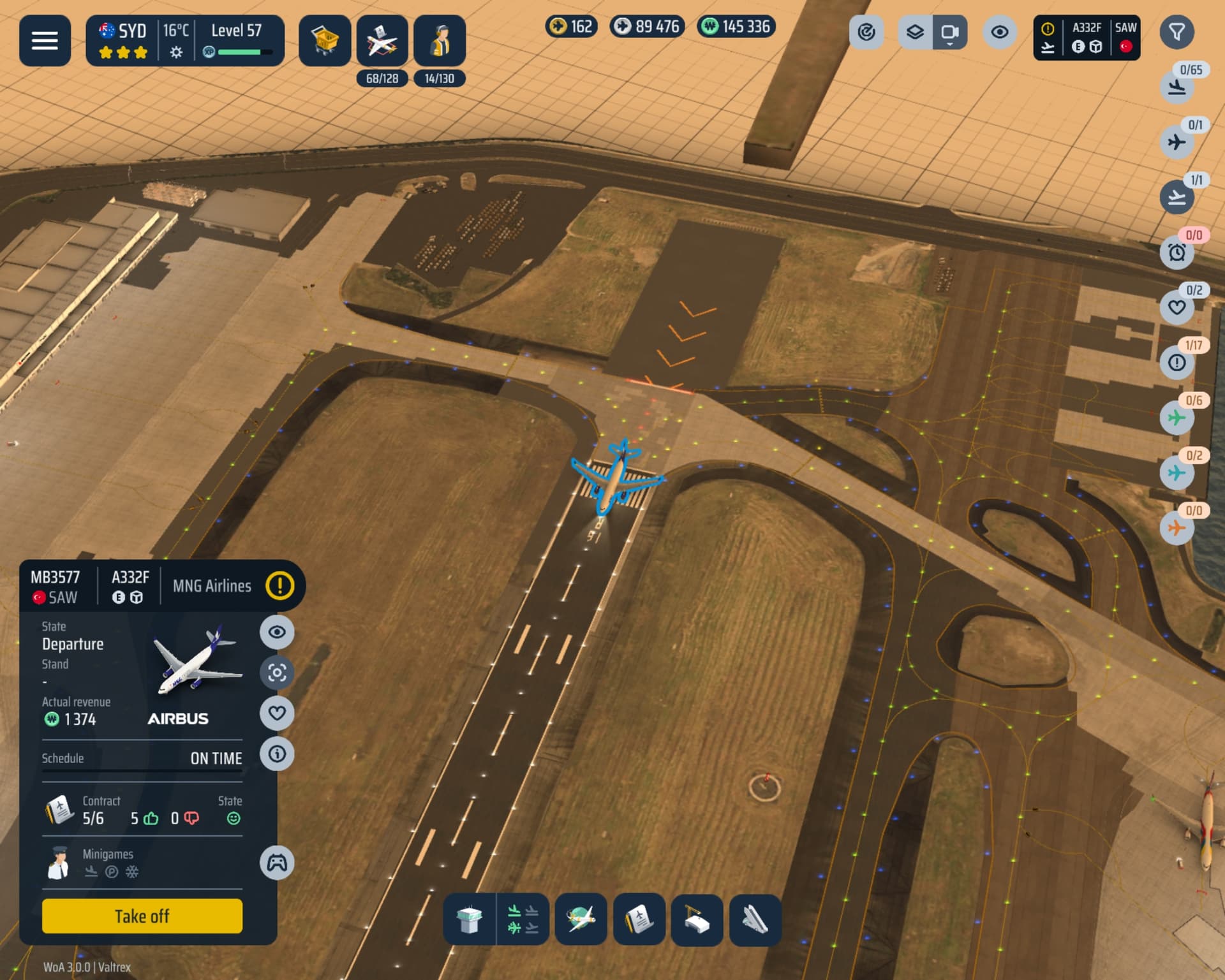
Selecting the “Landing” + “Needs Attention” filters together, all landing aircraft are shown, even if there are no stands available that can accommodate them.
Either this is a bug, in which case I am happy to submit a bug report, or this is an intended change from 2.x, which makes it very difficult to manage large fleets.
Could the devs clarify?
14 Likes
Additionally, from a User Experience perspective, please remember that most of us play on phones and tablets, not emulators on computer monitors.
The new denser UI feels like a degradation from the perspective of being able to consume the information and interact with elements. Overall there is also less differentiation to help users identify elements they can and should interact with.
(I do this for a living, btw)
The new features and bug fixes are wonderful, but I’m not loving the dense UI. It’s simply much less intuitive.
It is very evident a lot of hard work went into this release, so this isn’t an indictment of that, but my recommendation is to take this into consideration with future UI decisions
18 Likes
I agree. I think the aircraft handling with the slider and the plus button is too far to the right and too far in the middle of the screen. This was better addressed in UI 2.0
2 Likes
Woohoo!
6 Likes
Sadly I have to agree with certain comments, while overall looks of new UI is great, it’s usability got worse
As many people already mentioned filters don’t work as they did before - “requires action” not only shows actionable planes but also those that are waiting for landing but there is no available gate for them…
My issues are mostly related to phone I play on - Galaxy Fold 3 -
Firstly every font and button are significantly smaller than were in 2.X which makes things harder to read - not sure if that’s by design or because my phones resolution caused some odd scaling but I’m hoping for some fix
Secondly, my screen is fairly square so having list of actionable planes go from top rather than bottom as it was in 2.X makes those few last planes harder to reach (and also harder to spot since i got used to them pop up from bottom right not top right) - I’d love have option to list planes from bottom again
And thirdly - again tiny nuisance mostly related to just my phone model - previously we could rotate phone both ways in landscape and now we are limited only to one way, which causes me to cover my speakers why my hands when I’m holding my phone which wasn’t an issue before…
Overall I like vision of changes that we got but those tiny issues are bit annoying and love to at least hear if there is possibility of improvements in the future
Still big thanks @Flyboys
Picture for scale of UI on Galaxy Fold 3
17 Likes
Hope you can see this thread. Thank you for a great game:
https://www.reddit.com/r/Worldofairports/s/D05G6Jj3fW
Best regards,
JDR
2 Likes
I understand everybody’s criticism’s and I agree with most of them. But you must remember, it was the exact same way when we went from 1.0 to 2.0. I saw people on all platforms saying “This update ruined the game” and “can we please go back to 1.5”. But over time, the devs made improvements, and in the long run, that 2.0 update(personally) made the game better. So to anyone who feels this update made the game worse, remember, this is still just 3.0.0. There is still sooo, much potential and room to improve. Personally, as of now, I prefer the way things were in 2.6, but I have faith in the devs. Faith that has produced fruits before, and I know that will again.
13 Likes
Exactly.. ![]()
2 Likes
Well, kudos on a significant update. But why did you have to go around and change the categories of aircrafts. Now I have to go back to all the older airports and sell B752 and but a new aircraft which will be profitable in C category. Increased the working and displeasure. Otherwise, i am liking the new interface. It will have a learning curve but will work. And thank you for Arrival vs Departure priority, finally back.
Additionally, I would request the team to reset the levels like they used to do earlier as well.
Unfortunately due to the change in format for V2, levels will not be reset like they were before. So all we will get is additional levels on top. Not start from 0 again
3 Likes
Please add Air China route from Madrid to GRU please
2 Likes
I understand that, but the catagory thing is pain in my a**. I have to sell most of my M type aircrafts now as they no longer for in M Type stands. And that too in every airport.
And don’t even talk about INN, only 1 stand with D type, so now I have to stop all outside connections that has D type craft. Same with BRI, PRG, IAD, and that is as far as I have gone. I still need to check others.
Now B752 will become least used aircraft because of that.
1 Like
The new ui is difficult to operate. I miss the old one
3 Likes
Lot’s of criticism about the new UI, but to be fair i love it, much more intuitive then the previous one. Yes i also need to get used to it after playing the old one for years, but it’s a great improvement!
Assigning handlers with a slider is probably by far the best improvement i’ve seen ![]()
Only thing that needs to get sorted, and i’m sure the Dev’s will sort, is that landing aircraft without available stands appear in the to be actioned filter, which makes filtering a bit harder until it’s fixed.
10 Likes
Agreed