Also would be nice to hide planes waiting assignment to a stand if there is no stand available. Like it was before. And maybe double-tap to assign the stand?
2 Likes
So if you get these do you have all those aircraft to buy without saving up GP?
3 Likes
They should make B1 the only cargo stand for D/E planes like IRL
Now that we have shared stands for cargo/pax
Exactly, its hard to recognize
Agree with all and mostly for a beginner like me (I’m at PRG rn) the new ATC prices are insanely high. I don’t know if I can use ATC now, I need to upgrade to more rewarding planes for a profit with the ATC
1h ATC before v3.0: 60+40+40+40 = 180
1h ATC v3.0: 540
Am I right??
Btw I love the new UI. It’s only confusing for planes with a stand and planes without a stand in the same list
3 Likes
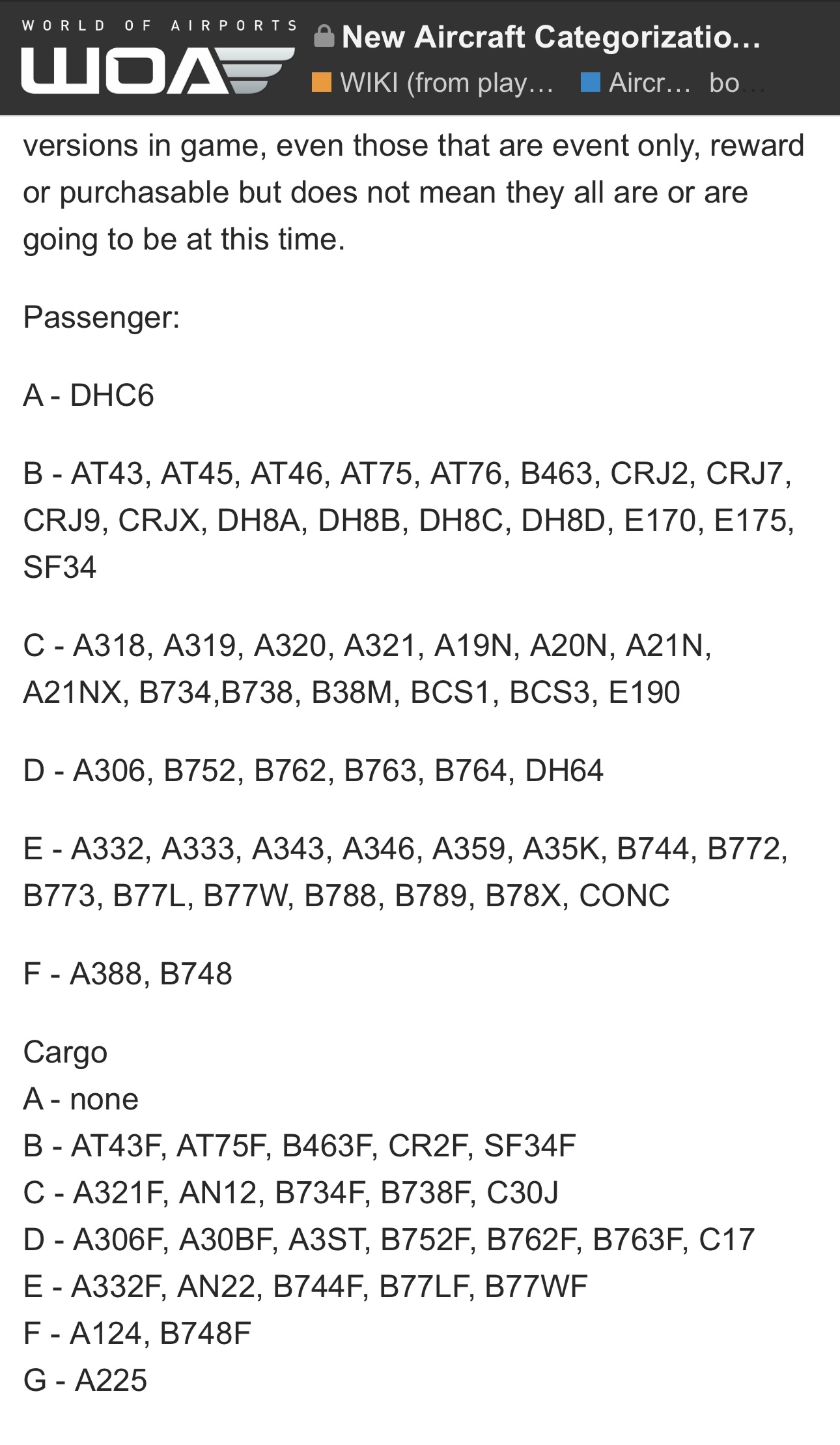
Help, can you tell me what are the M, L, X parkings now?
That would have been a really nice feature to have, yes. Although you could perfectly well do it without the extra tap. Just have the larger plane wait until the previous plane takes off. It already worked like that before, when you had a plane line up behind a large departing plane that took a while to take off.
And I just tested it in SXM, and no, you still cannot line up a small plane while a big one is backtracking to get into position to take off.
The menu selection button is too small for my fingers. I often select the wrong menu button.
1 Like
Ask how I recognize a plane that has a contract because I am very late, if anyone knows how I could recognize them before it was with the heart and the little watch that were present But now Without them how do I recognize them? Please help.
2 Likes
ATC was sooo cheap on 2.0. Silver planes are free, play more - get more. I loved 2.0, love 3.0, just love a new airport too. Amazing work devs - thank you
3 Likes
Yes, very difficult. It would be easier to hide them
I’m really struggling with this update, the color differences in the 2D view are way too subtle. For example, I miss the orange/blue flight information to quickly tell if a plane was “coming or going.”
The UI looks pretty, but the fonts and icons are nearly impossible to read on my phone. Some examples: the plane size under the type when looking at an individual plane, the numbers for each status on the filter, and most things in the info screen for a plane - lack of contrast and itty bitty font. I know UIs are extremely time consuming and hard to get right, and part of the game is the amount of information, but sometimes less is more (if you want to keep phones as an option).
The sliders for handling crew are nice and I look forward to automatic de-icing to remove one step I never understood (but I guess the larger step of having to take my planes off kind of offsets this). My strategy of over-buying the X stands at my newly unlocked airports paid off though since now I have plenty of lower-sized stands. ![]()
Other things I like about this: I really like include having more control over the tower controls, improvements, blocking stands visibility improvements (especially helpful when purchasing stands), preview of airports before unlocking/purchasing, and the better granularity of plane sizes.
6 Likes
thank you Flyboys!!
i cannot see the map, when i am looking for contracts. Is this a bug, did anyone els has the same problem?
1 Like
I have the same problem on one device, but it works fine with another one I have.
thx for info, so i have a problem with my device. restart, clear cache and than i try again…
Thanks
1 Like
Great to see updates to the CJR type and the introduction of GRU. But as noted by others here the UI is too busy and far too small to be used on the devices for which it is designed. Particularly the connection list is too small and cramped, it would be good to be able to have the option of small or large icons, it is going to slow down game play.
2 Likes
Yes, on the aircraft waiting to land the yellow exclamation mark is annoying as I keep thinking it’s got a stand available to go to but it’s not.
4 Likes