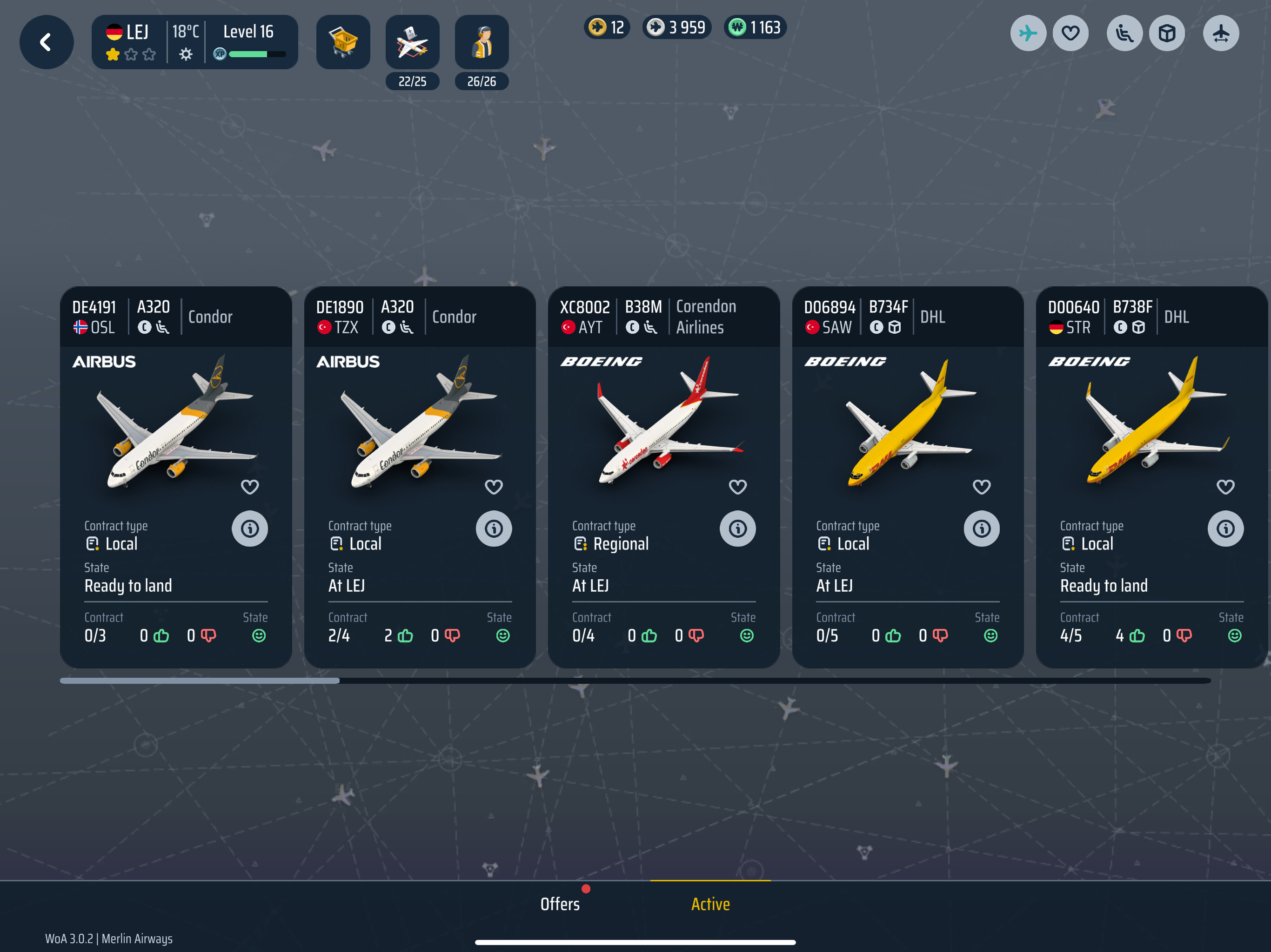
I have to be honest I don’t really like the new active list UI. Before I was able to scan along my contracts and check them all if I need to compare, now I have to do it individually.
I’m a bit annoyed of how big the right panel is😂 I know many players complaining it’s too small in 3.0.1 , but now it’s too big, atleast for me
4 Likes
It’s back to the scale of 2.0. It’s just a bit of a readjustment. It’ll get better. Personally I quite like it
1 Like
It’s not the scale that was my problem.It was that I can longer turn all my active contract cards over enabling me to scroll along the list .Example I needed to cancel a contract scrolling allowed me to compare more than one at a time….if that makes sense ))
Please let users choose how big the font size are. Phone users may like larger fonts but tablet users may have other views. If you have 100+ contracts you won’t like to scroll for so many times.
If you don’t like it, you can send an email feedback to ask them to improve.
Ooh I see what you mean.