The first option (the middle one) is very good from my view…!
9 Likes
I agree middle one with airline logo I love
2 Likes
That does replace the thing signifying cargo or pax, but then again it’s pretty each to see the “F” in the aircraft class, so I guess it really doesn’t hurt to replace that, I’m all for the middle one too
3 Likes
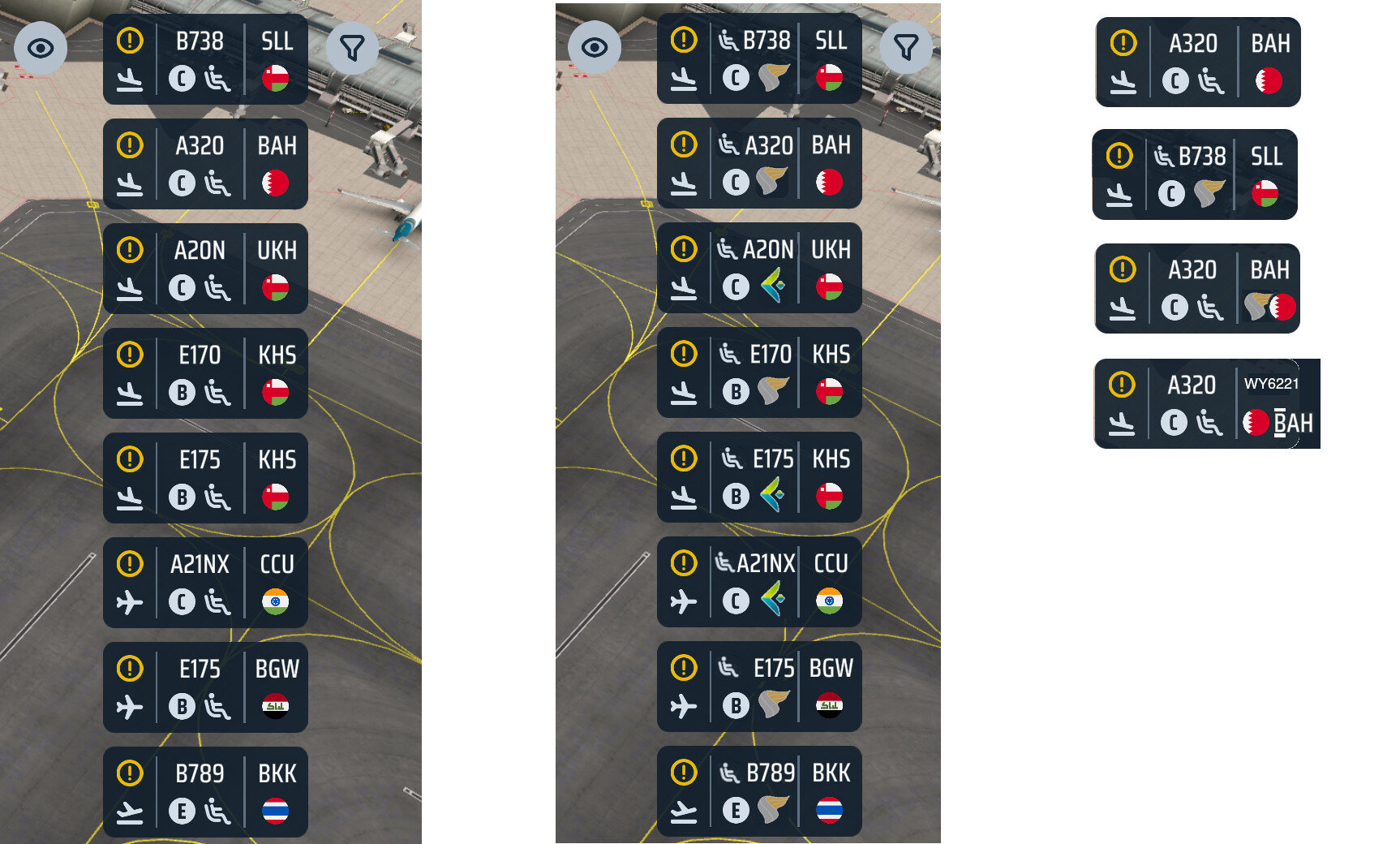
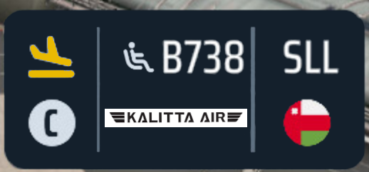
Actually, passenger (and cargo icon) is moved next to aircraft code… look above class…
everything is still there…
3 Likes
No need to make it so crowdy. The yellow exclamation mark doesn’t add much value that can’t be signalled differently. Move a few icons around and voilà:
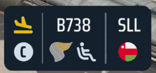
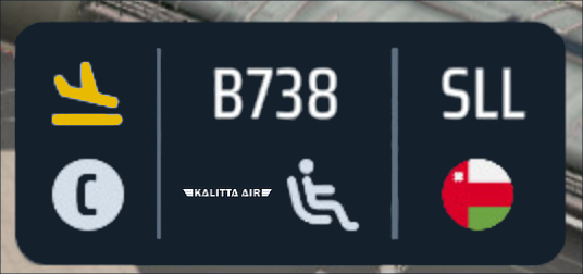
This doesn’t address the fact that some logos or brands are not square in dimensions and are not an obvious fit. Those would end up tiny or would require some arbitrary modification.
3 Likes
Really like this idea with the yellow plane replacing the exclamation mark
1 Like
This one is very good! Earlier I thought about if we need to extend the card a bit to accommodate all the info.
Actually I would prefer the passenger icon to swap with the category icon. So the middle shows the aircraft type and the carrier logo.
2 Likes
I disagree. Here’s why I think this division in thirds works.
| Information relevant for infrastructure |
Information relevant for servicing |
Destination |
| Required part/location of airport |
Maximum pax count (type) |
Destination airport |
| Required size of part |
Service level (brand) |
Country flag |
|
Service requirements (pax/cargo) |
|
2 Likes
There can be more space by moving passenger/cargo icon in top row, but it still can be too small, especially on smaller phones
2 Likes
What is your suggestion?
How would it work in the game?
Why is this a good idea?
Image or reference