Title Format (required):
UI – Use color tones with low saturation
What is your suggestion?
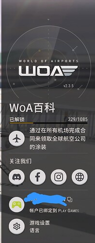
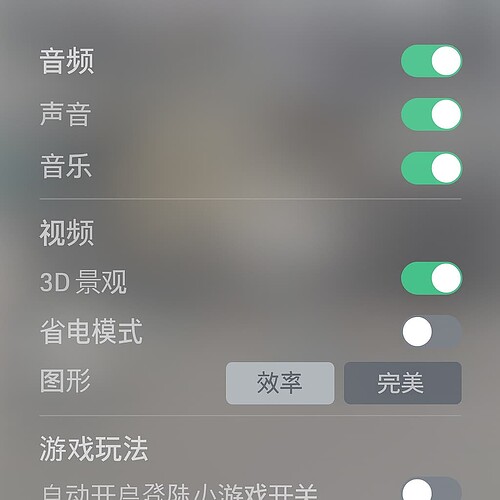
It is suggested that the production team consider restoring the gray tone of the previous game, as the current deep blue is not very user-friendly in terms of appearance (it can be tiring to watch for a long time). There will also be many issues of accidental contact.
How would it work in the game?
Use low saturation color UI style for gaming
Why is this a good idea?
Colors with low saturation can help players play for a long time without getting tired. There has been a significant improvement in appearance.
Optional: Image or reference

